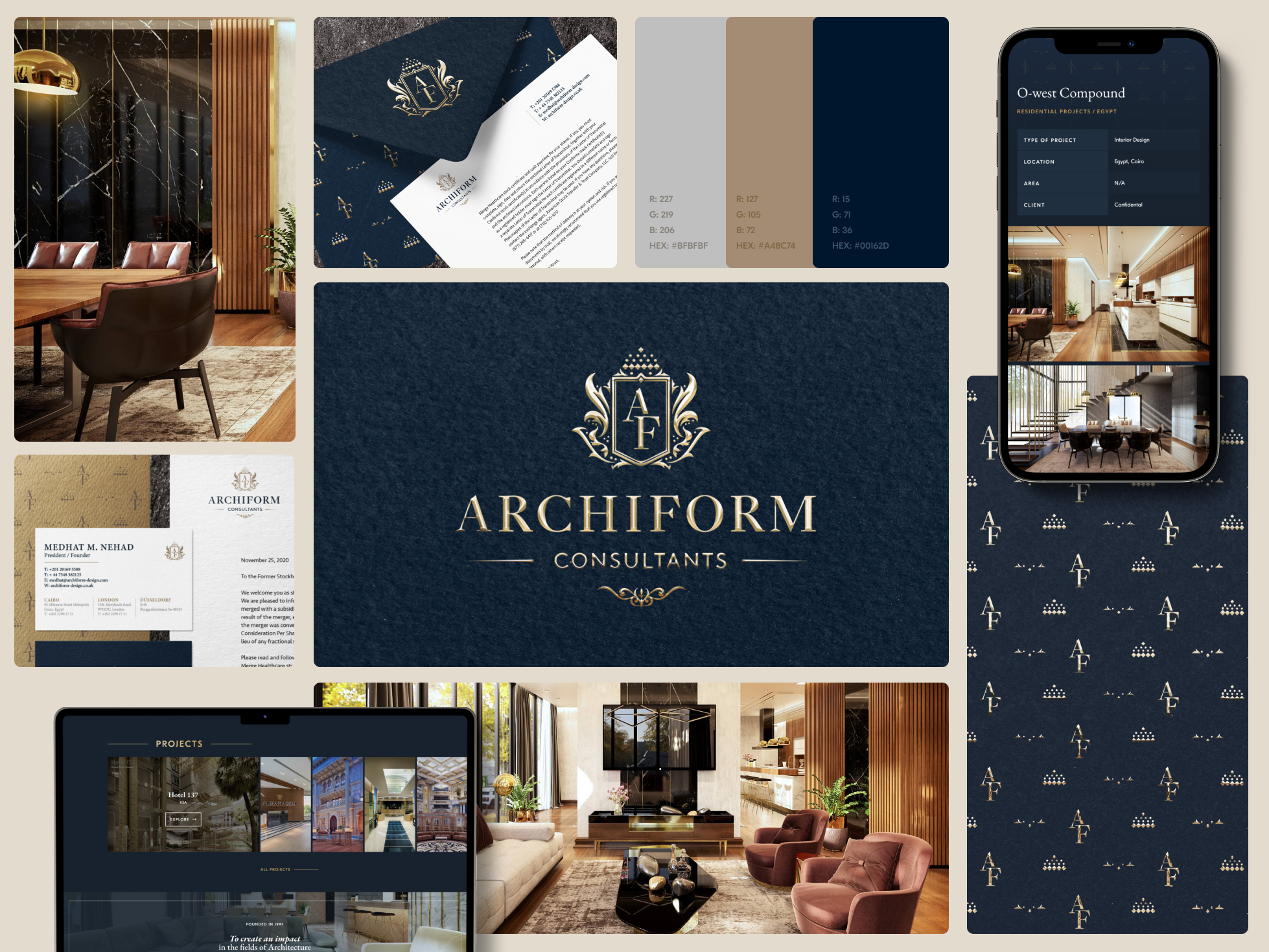
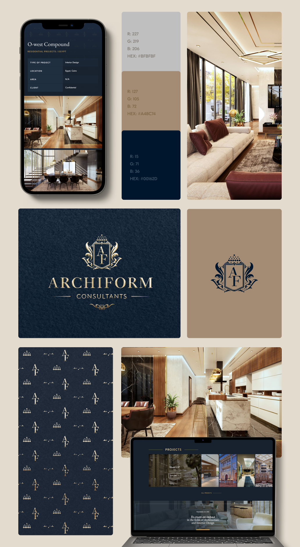
This exciting project was crafted for Archifrom, a prestigious Egyptian architecture studio known for their high-end projects spanning the globe.
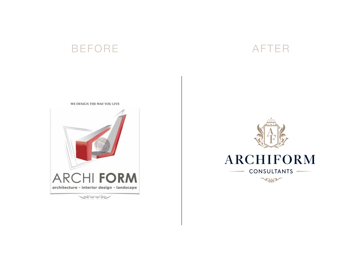
To breathe new life into their brand identity! The client already had an existing brand identity, but it was starting to feel a bit outdated and no longer aligned with their brand’s current positioning.
To create a fresh, visually captivating representation that truly captured the essence of Archifrom’s values and expertise.
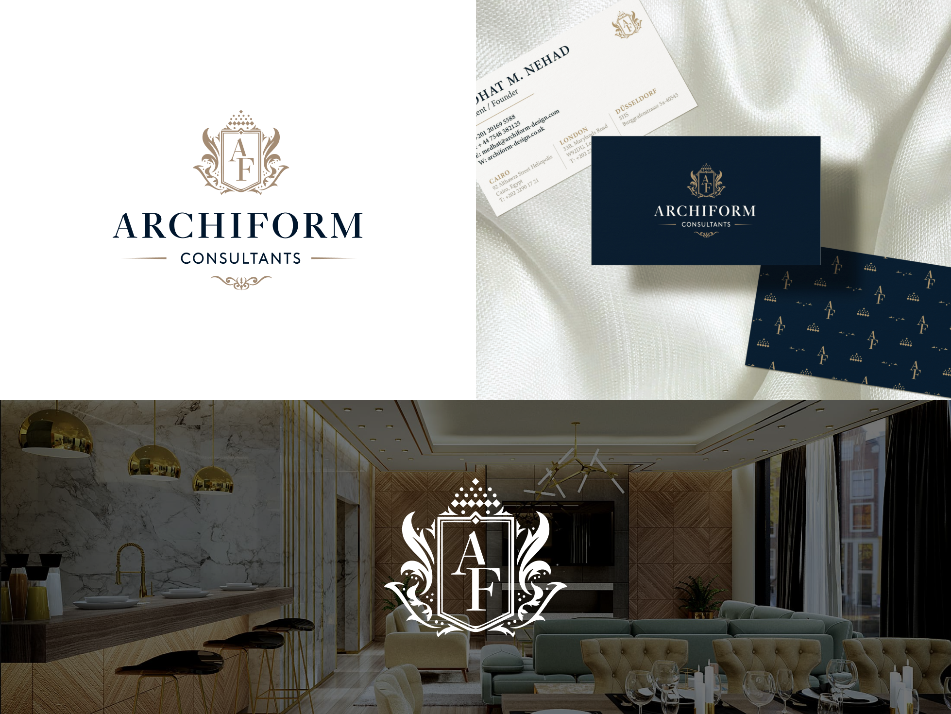
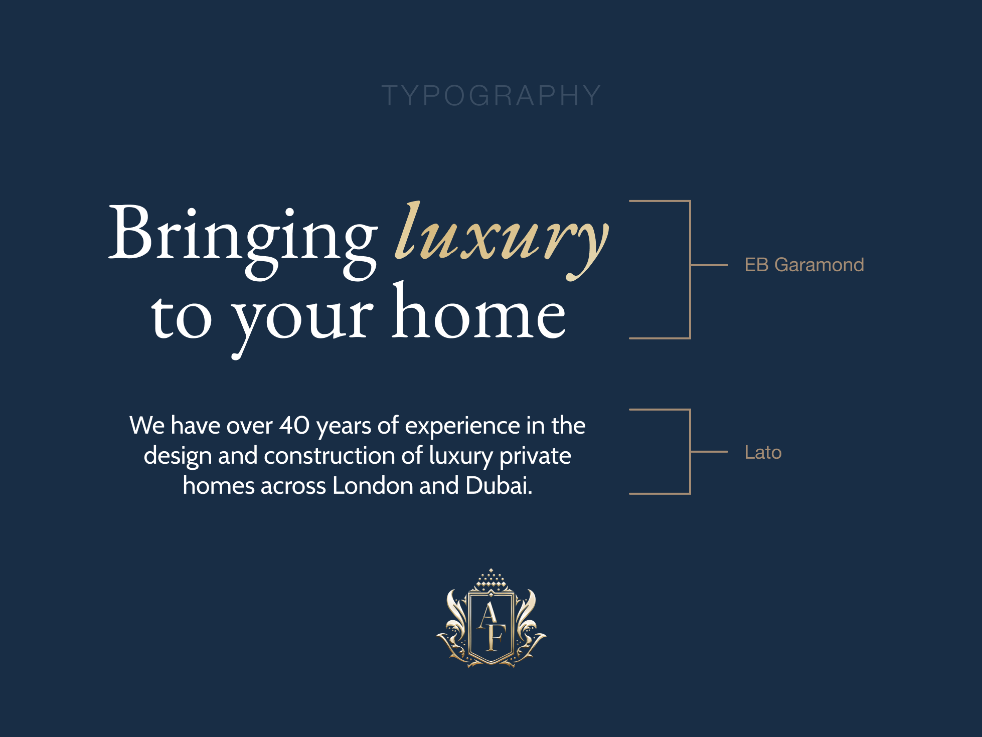
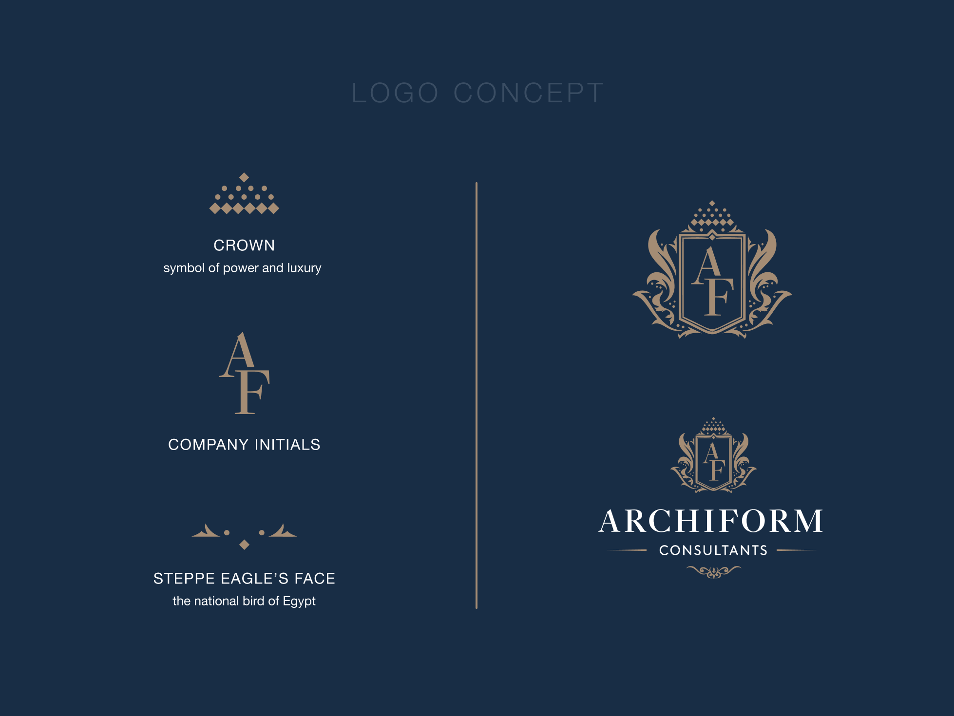
The client had a desire to weave Egypt’s history into the logo, which is why the eagle was chosen as a prominent element.
The client’s key requirements also included the colours gold and blue. Gold symbolises luxury and wealth, while blue can be associated with elegance and stability.
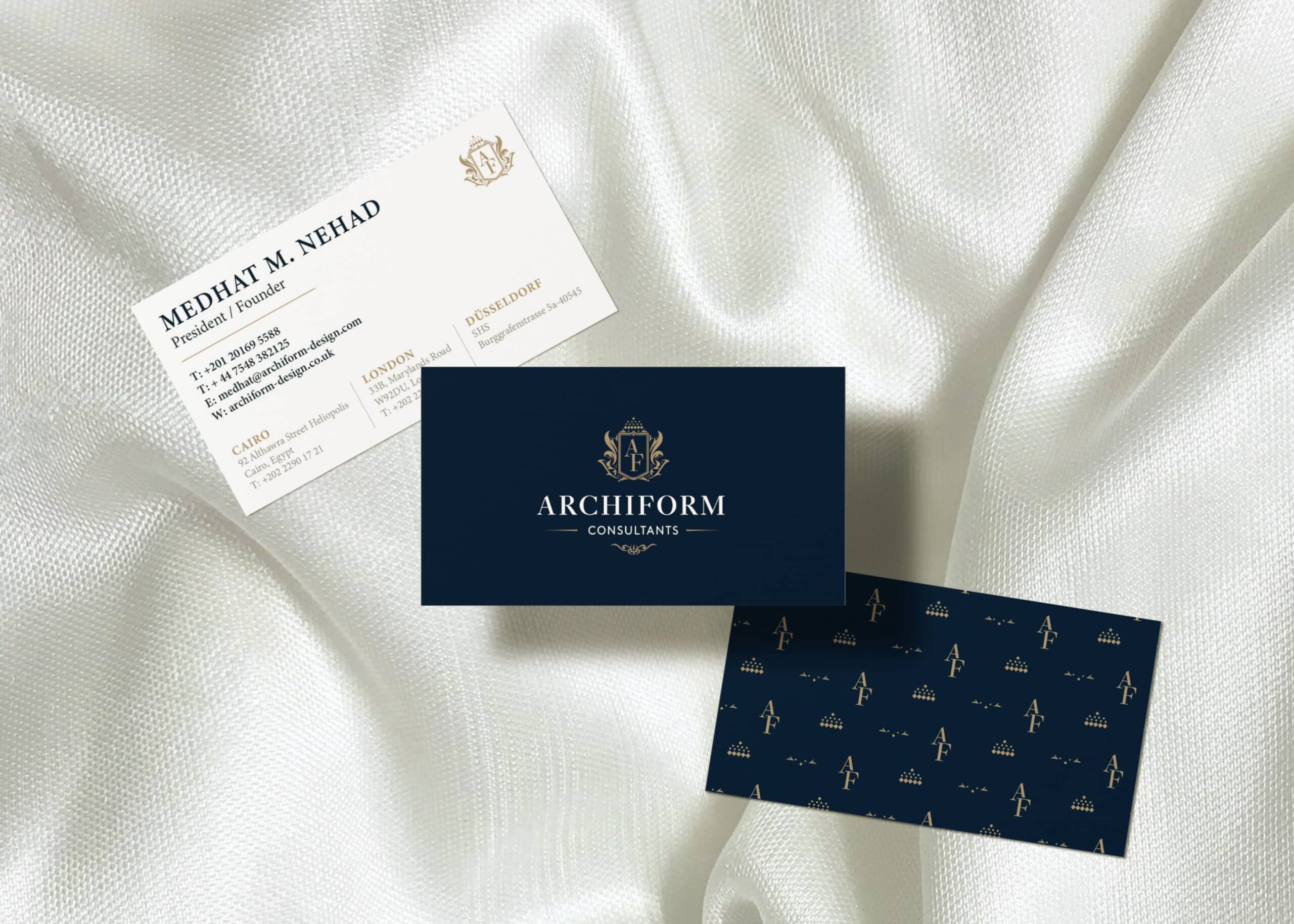
My aim was to showcase the remarkable quality and prestige of their work, and we couldn’t be more thrilled with the results.
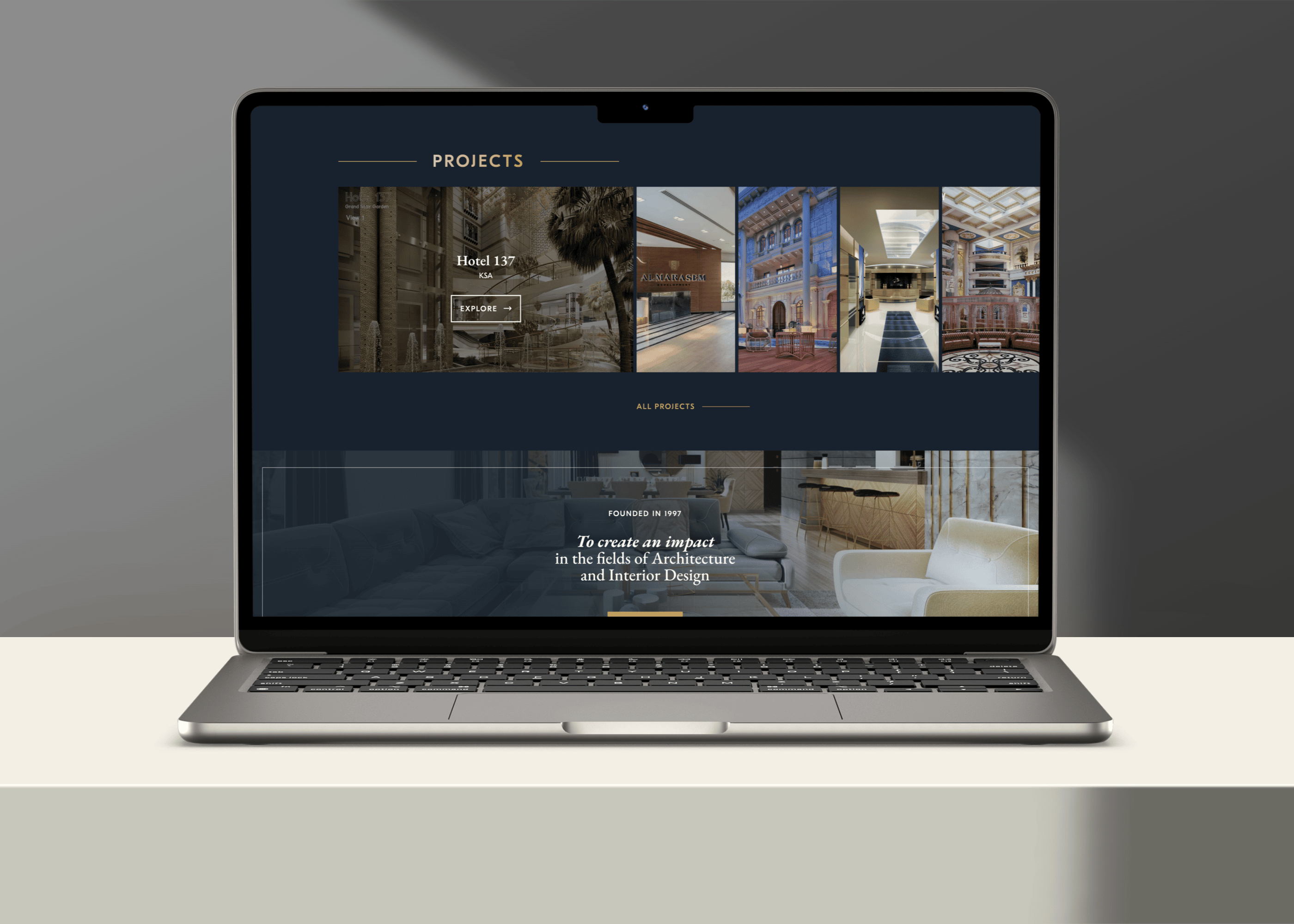
In addition to revitalising their brand identity, I also designed their new website, creating a seamless online experience that perfectly complements their new brand image.